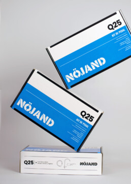
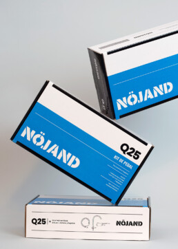
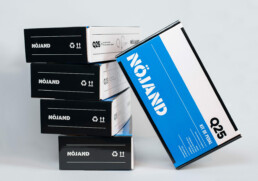
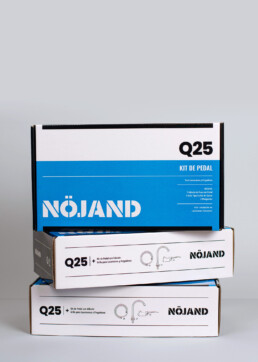
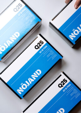
A packaging design inspired in Scandinavian minimalism.
Brief:
When the Covid-19 pandemic hit, our client created “Nöjand”, an innovative hygiene brand to help people protect themselves from the virus. We were tasked with creating the visual identity for their new brand and its first product, the Q25.
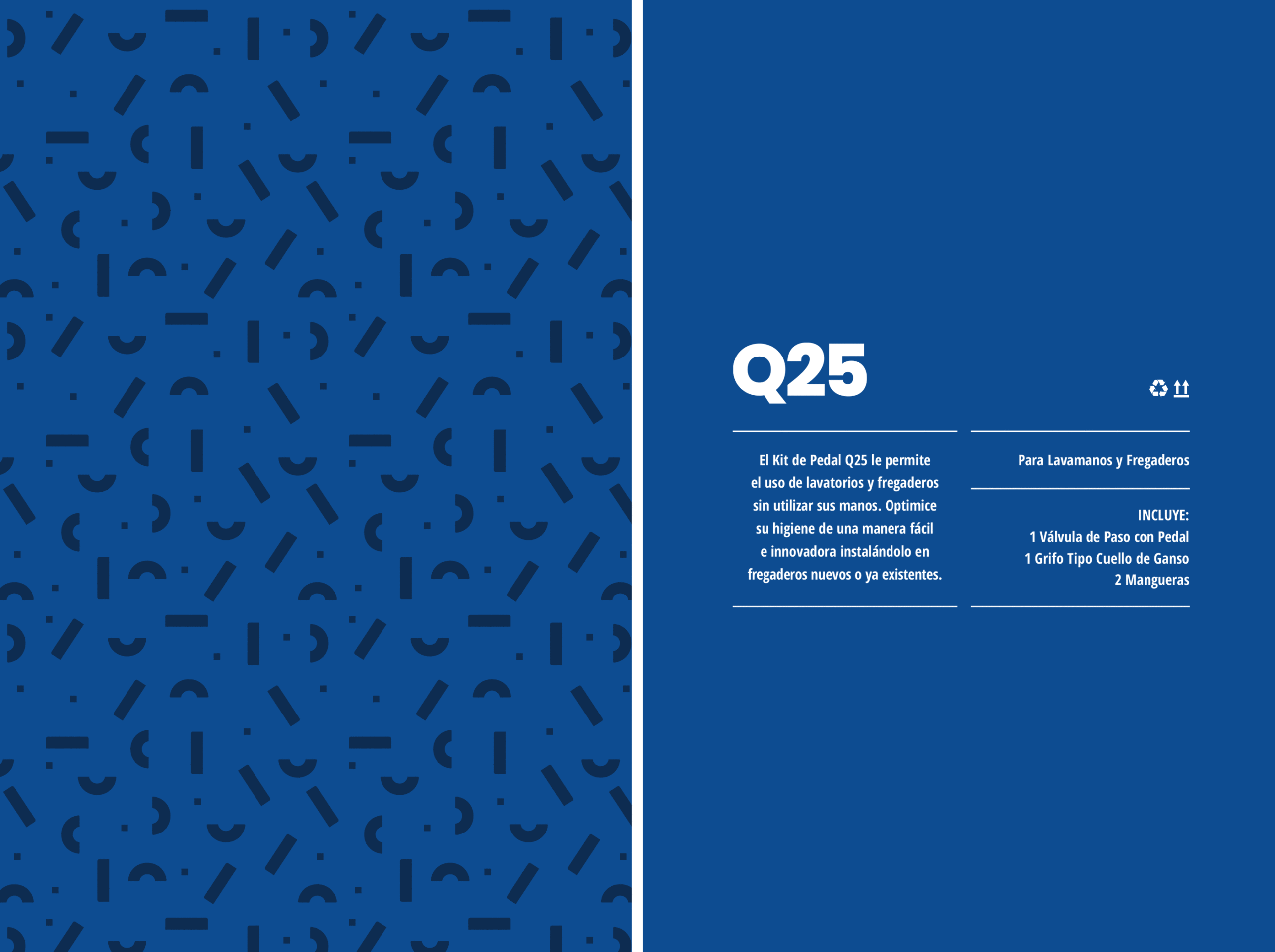
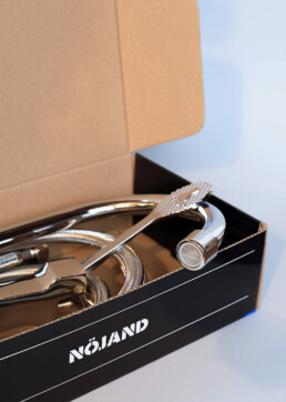
The Q25 pedal kit can be used in washrooms and sinks without the use of hands for better hygiene and safety.
Our Process:
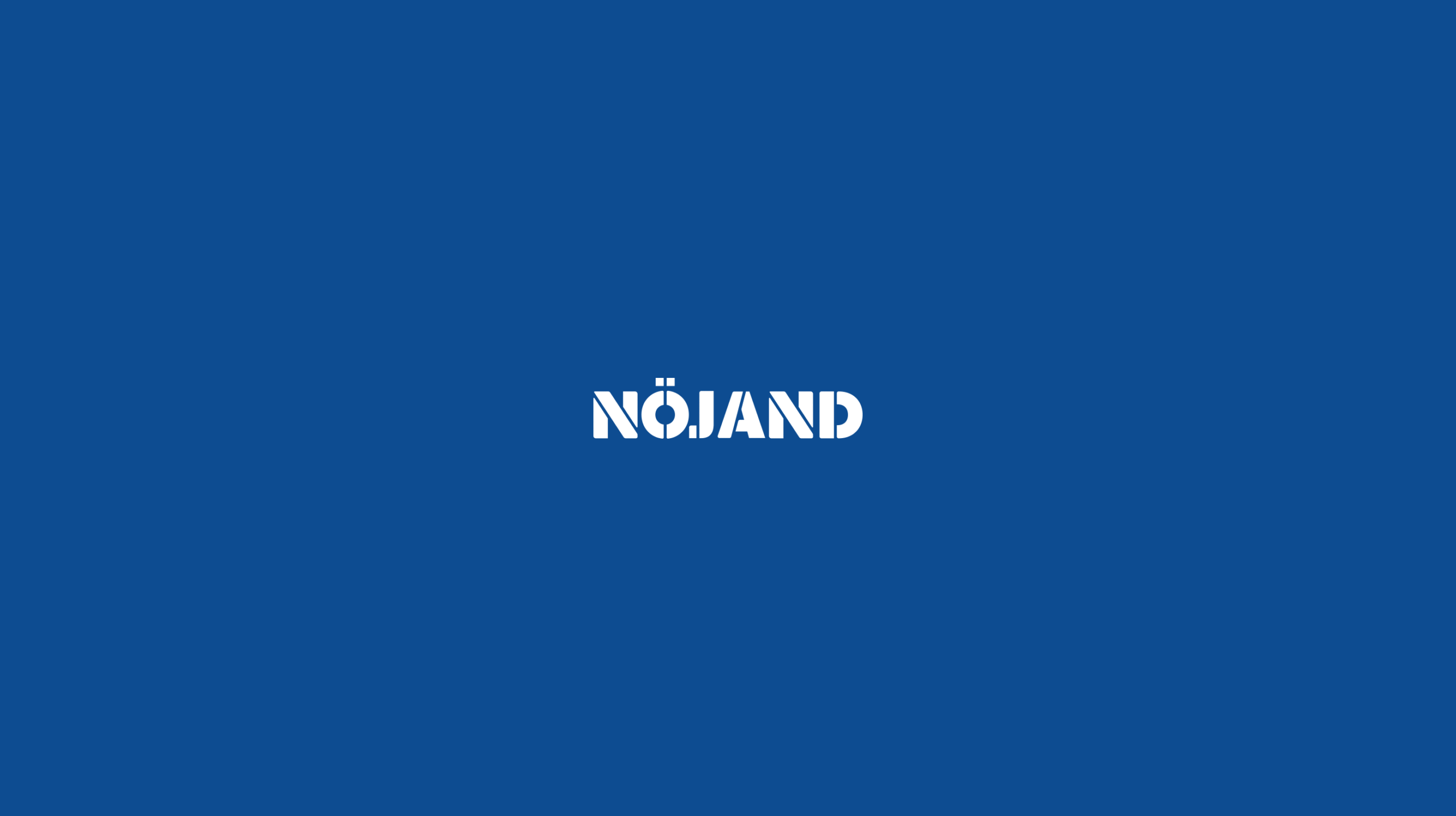
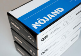
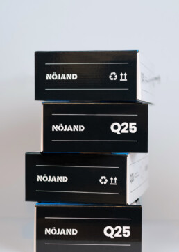
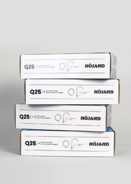
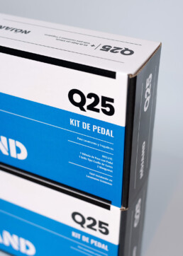
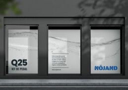
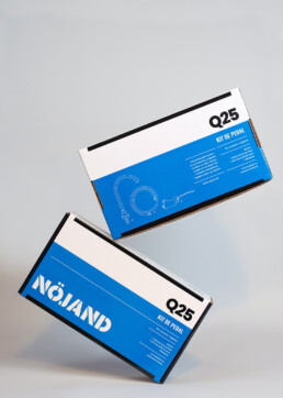
Our approach to the visual identity was to create a minimalist look, inspired by Scandinavian minimalism. We created simple graphics that use a limited color palette of blue, white, and black.
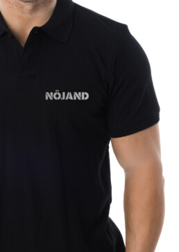
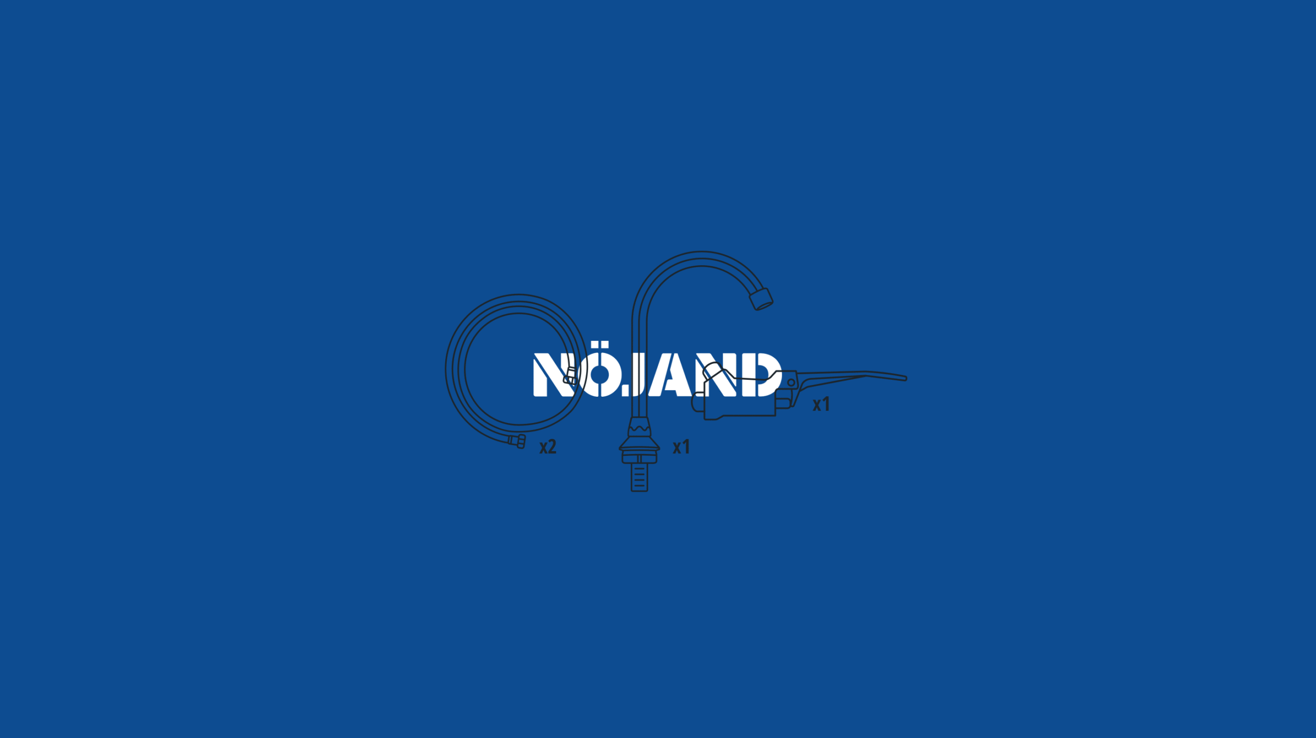
We also created a logotype using custom-made typography that communicates the values of bold, trustworthiness and reliability, that a product like this should have. On the packaging we incorporated linear illustrations of the product for a simple, clean, and minimalistic look.
Client: Nöjand Services: Brand Identity, Packaging Design
