Mariana and her team were fantastic to work with. Responsive, understanding, and organized. Most importantly the quality of the work is exceptional. I am tremendously proud to be represented by the branding that Design Etiquette created for my business.
Brandon Chillingworth — Hacked BD
The Beatles, Branding & Lasting Impact
— The Beatles, Branding & Lasting Impact — The Beatles, Branding & Lasting Impact
Branding, Brand Identity, Strategy
Imagine waking up in a world where The Beatles never existed. No ‘Hey Jude,’ no ‘Let It Be,’ no Abbey Road crosswalk photo.
Jack is a struggling singer from the UK. One day, he wakes up to find the world in total chaos after a solar flash sends civilization into panic.
That afternoon, he grabs his guitar and meets his friends for a Sunday picnic in the park. He starts singing:
“Yesterday, all my troubles seemed so far away,
Now it looks as though they’re here to stay…”
His friends stare at him, shocked. That’s the best song he has ever written. Tears start running down their cheeks as he finishes.
Jack laughs, thinking they’re being sarcastic, until he realizes they’re dead serious. They have no idea who John, Paul, George, or Ringo are.
As the days pass, he discovers that the solar flash has erased parts of everyday life. He now lives in an alternate world where Coca-Cola doesn’t exist. You can go to a Coldplay concert, but Oasis? That’s just water in the desert. And The Beatles? They were never a band.
So Jack starts recreating their songs from memory. Half-finished versions of Hey Jude, Yellow Submarine, and Let It Be become his songs.
This is the premise of Yesterday, a film that imagines a world without the Liverpool legends. It’s funny, smart, and leaves you thinking long after it’s over.
Ask yourself: What person, brand, or experience has made your life better? The one that, if erased in some alternate dimension, would leave a noticeable void?
I have my favorite people and brands; the ones I read, listen to, or engage with every day. And then there are a select few I’d truly miss if they disappeared. Life just wouldn’t be as exciting without them.
For many in Yesterday, that was The Beatles. Life just sounded better with their songs.
This movie made me wonder: What impact are we leaving on this world?
Are you influencing someone, even just 1%, the way The Beatles did? Whose life are you making better? Who would genuinely feel your absence?
And in business terms, is your brand or product truly making a difference in people’s lives?
Because that’s what we should all strive for, creating something so meaningful, so impactful, that if it disappeared, people would actually miss it.
That’s the power of great creativity.
Mariana and her team were fantastic to work with. Responsive, understanding, and organized. Most importantly the quality of the work is exceptional. I am tremendously proud to be represented by the branding that Design Etiquette created for my business.
Brandon Chillingworth — Hacked BD
Is Your Brand a Gordon Ramsay Meme?
— Is Your Brand Turning Into a Gordon Ramsay Meme? — Is Your Brand Turning Into a Gordon Ramsay Meme?
Branding, Brand Identity, Strategy
Doing this is the quickest way to destroy your brand and the slowest way to grow your business:
Creating a brand isn’t just about creating a logo or putting together a website. It’s about crafting an unforgettable story, building brand awareness, and creating a connection with your audience.
But here’s where many businesses go wrong: They invest thousands into creating their brand identity, only to hand off their brand’s management to someone who doesn’t fully understand what they’re doing.
Think of branding like high-end cooking.
You hire a world-star chef like Gordon Ramsay to craft a perfectly cooked 5-star Michelin dish, then you hand the recipe off to someone who lacks the skill and knowledge, like your friend from highschool who thinks he’s a chef because he cooks BBQ every Sunday afternoon.
Even though he has the recipe, the dish is a complete fail. It doesn’t have the right flavors, the presentation is sloppy. The magic? Gone. That’s what happens when a business hands off its brand to someone who doesn’t understand design and marketing fundamentals.
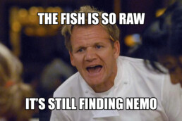
When a low-skilled designer takes over a brand, the core identity gets diluted. You’ll start noticing fonts that were never in your brand book, colors that seem just a little off, (believe it or not, there is a ton of technical skills that go into color management) and visuals that scream ‘DIY.’ Suddenly, the polished, cohesive brand you invested in starts feeling cheap, like a five-star meal that’s turned into a Gordon Ramsay meme.
Consistency is everything in branding. Making this gap in skillset your brand’s nemesis.
When you maintain a consistent identity, customers begin to trust you, and that trust builds loyalty. A great branding agency creates a comprehensive style guide that defines everything from colors to tone of voice to design principles. When you have a solid guide, your branding team can stay on track, and your business can continue to evolve without losing its identity.
To keep your initial brand identity and strategy from falling into oblivion, here are a few actions you can take:
- Build a crystal-clear style guide with your agency, a.k.a your brand book. A brand book isn’t just a document; it’s your brand’s bible. It ensures that everyone, internally and externally, is on the same page.
- Train your team on your brand’s ‘dos’ and ‘don’ts.’ Ensure everyone knows how to speak and present your brand consistently.
- Keep your branding team close. Invest in the best professionals that fit your budget, and keep them on retainer for as long as possible. A long-term partnership ensures your brand stays consistent, evolves with your business, and thrives.
Your brand is your business’s first impression. Don’t let shortcuts or budgets destroy the investment you’ve made.
What’s your biggest challenge with keeping your branding consistent? Let’s talk.
Mariana and her team were fantastic to work with. Responsive, understanding, and organized. Most importantly the quality of the work is exceptional. I am tremendously proud to be represented by the branding that Design Etiquette created for my business.
Brandon Chillingworth — Hacked BD
10 Branding Tips for Business Growth
— 10 Branding Tips for Business Growth — 10 Branding Tips for Business Growth
Branding, Brand Identity, Strategy
This took me 14 years as a brand designer to learn, I’ll teach it to you in 3 minutes.
Branding is constantly evolving, but there are certain principles that will always hold true. After 14 years of building brands and seeing what works, I’ve wrote down the most important elements of successful branding. If you’re looking to build a strong, memorable brand, here’s what you need to know:
1. Clarity Is King:
Your brand needs to be clear and easy to understand for your audience. If people don’t get it, they won’t buy it.
- Be clear on your offer: Make sure your audience knows exactly what you’re selling.
- Keep things simple: Don’t overcomplicate your messaging.
- Create systems: Simplify your processes to help customers quickly understand how to engage with you.
- Make your marketing straightforward: Focus on simplicity to boost your impact.
2. Make Your Offer Irresistible:
Your offer should feel like a no-brainer, making it impossible for your audience to say no.
- Sell the dream outcome, not just your service: Focus on the result you provide, not just the features.
- Use guarantees to minimize risk: Make customers feel safe to take action.
- Stack bonuses to amplify value: Offer extra perks that make the deal even better.
- Make buying frictionless: Remove any barriers to purchase.
3. Know Your Customer:
Building a brand is much easier when you truly understand who you’re speaking to.
- Get to know them by asking questions: Take the time to understand your audience’s needs and desires.
- Identify their biggest pain points: Understand what keeps them up at night.
- Speak their language: Use language and messaging that resonates with them.
- Solve their problems better than the competition: Show how your brand can uniquely meet their needs.
4. Start with Strategy:
Without a solid strategy, your brand will lack direction and focus.
- Define your brand’s positioning and unique value: What sets you apart from competitors?
- Understand your market: Know the trends and the competition.
- Set clear goals for growth: Establish measurable objectives for your brand.
- Build a brand that drives results: Focus on outcomes that contribute to long-term success.
5. Your Brand Identity Is Not Just a Logo:
Your logo is just the start. Your brand is much deeper and more complex.
- Create a complete visual identity: Color, typography, patterns, marketing assets.
- Define your brand’s personality: What values does your brand embody?
- Maintain consistency across all communication: Whether it’s on your website, social media, or packaging, stay aligned.
- Focus on user experience, not just visuals: Your brand should feel right at every touchpoint.
6. You Need 7 Touchpoints Before Making a Sale:
Building trust takes time. On average, you need several interactions before a customer is ready to buy.
- Show up consistently across multiple platforms: Be where your audience is, consistently.
- Educate users about your brand: Provide value through informative content.
- Facts tell, but stories sell: Nowadays storytelling is everything.
- Nurture leads until they’re ready to buy: Stay connected and keep building trust.
7. Branding Is the Act of Building a Brand:
Branding is a continuous process. It’s not just something you do once and forget about—it’s an ongoing effort.
- Build relationships: Your brand is about people, not just products.
- Create an emotional connection with your audience: The best brands evoke feelings and loyalty.
- Deliver a consistent experience every time: From first contact to repeat business, consistency is key.
- Invest in long-term brand value: Branding is an investment in the future of your business.
8. Consistency Builds Trust:
Your audience needs to see and hear the same message repeatedly to build trust.
- Stay consistent in your messaging and design: Everything should align with your brand.
- Show up regularly: Your audience needs to see you frequently to build recognition.
- Reinforce your brand values in everything you do: Make sure your actions match your words.
- Keep delivering on your promises: Trust comes from reliability.
9. Mindset Is Everything:
Your beliefs shape your success.
- Confidence attracts clients: Show up with belief in what you offer.
- Learn from failures and keep going: Every setback is an opportunity to grow.
- Surround yourself with positive people: Build a network of like-minded individuals who encourage growth.
- Take action every day: Momentum compounds over time.
10. Rebranding Can Be the Answer to Business Growth:
A fresh brand identity can be the key to unlocking new opportunities.
- Resonate better with your ideal customers: Sometimes, a shift in messaging or visuals is all it takes.
- Adapt to the times: If your brand isn’t keeping up, it’s time for a change.
- Stand out in a crowded market: Rebranding helps you break through the noise.
- Reinvent your brand to reflect new values, goals, or offerings: Your brand should evolve as your business does.
Want to Build a Stronger Brand or Website?
Let’s talk: Schedule a free discovery call.
Mariana and her team were fantastic to work with. Responsive, understanding, and organized. Most importantly the quality of the work is exceptional. I am tremendously proud to be represented by the branding that Design Etiquette created for my business.
Brandon Chillingworth — Hacked BD
When To Rebrand
— When To Rebrand — When To Rebrand— When To Rebrand
Branding, Strategy, Business
Did you know that a rebrand can make or break your brand?
A brand redesign is a significant step. Here are some reasons why your business might need a rebrand or brand refresh:
1. Poorly Executed Brand Identity:
Maybe you didn’t invest in a high-quality brand identity from the start, or perhaps the designer or studio you worked with missed the mark. Now that your brand is more established and generating revenue, it might be time to hire a skilled professional to redesign your brand identity.
Ex: Starbucks
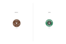
Starbucks’ logo was such an ugly baby that the company decided to simplify and modernize it in 1987, transforming the siren into a cleaner, less-detailed image. They also chose their famous green color to stand out in a market full of browns. This evolution helped Starbucks align with modern aesthetics and appeal to a broader audience.
2. Outdated Brand Image:
Brand identities should be timeless, but if yours feels outdated, it’s time for a refresh to stay relevant and modern.
Ex: Firefox
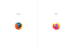
Mozilla Firefox’s logo had been tweaked slightly over the years, but by 2019, the classic fox circling the globe began to look outdated, especially with the rise of flat design trends. The company rebranded with a more abstract, simplified version of the logo, retaining the essence of the fox but using bold, vibrant colors that better fit modern design aesthetics.
3. Expansion or Diversification:
If your business expands into new markets or offers new products/services, rebranding can help communicate these changes effectively.
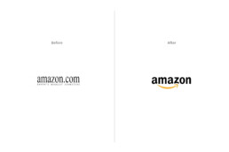
Ex: Amazon
Amazon started in 1994 as an online bookstore, with a logo that reflected its focus on books. However, as the company expanded into selling a wide range of products—from electronics to groceries—and eventually evolved into a global e-commerce giant, a rebrand was necessary. In 2000, Amazon introduced its now-famous logo featuring an arrow curving from the “A” to the “Z,” symbolizing the company’s shift to selling “everything from A to Z.”, reflecting its growing product diversity.
4. Mergers or Acquisitions:
After a merger or acquisition, rebranding can help unify the brand identity of the new business. This process goes beyond aesthetic changes, aiming to establish a new brand that resonates with customers, employees, and stakeholders.
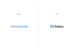
Ex: Meta
Facebook rebranded as Meta in 2021 to signify its shift from being just a social media company to focusing on building the metaverse. This change unified the company’s different platforms (Facebook, Instagram, WhatsApp, etc.) under one new identity.
5. Negative Perception:
If your brand has faced negative publicity or has gained a bad reputation, rebranding can help rebuild trust and improve perception. It’s a dirty move, but someone’s gotta do it.
Ex: Uber
After facing negative publicity due to internal issues and public controversies, Uber rebranded in 2018 with a new, friendlier logo and visual identity.

6. Innovation or Evolution:
As your business grows & adapts, there might be changes in your offerings or values.
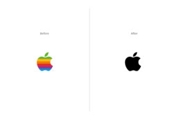
Ex: Apple
Although Apple hasn’t drastically changed its logo, the brand has consistently refreshed its identity to match its evolution as a tech innovator. From the rainbow-colored apple to a sleeker monochrome design, the brand reflects modernity and cutting-edge innovation as it continues to grow.
7. Changes in Name:
Whether you are changing your business name because it is difficult to pronounce, or because of Trademark conflict, a change in your brand identity is needed.
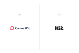
Ex: Kit
Recently, ConvertKit changed its name to simply ‘Kit,’ which I believe will benefit the brand immensely. The name change reflects their evolution from an email marketing tool into a broader creator-focused platform. Alongside the new name, they launched a refreshed brand identity that looks more modern and friendly, aligning perfectly with their mission to empower creators with simple and effective tools.
Is it time for your brand to evolve? Let’s explore how a fresh perspective can enhance your identity and impact.
Schedule a free discovery call today, and let’s talk about your business!
Mariana and her team were fantastic to work with. Responsive, understanding, and organized. Most importantly the quality of the work is exceptional. I am tremendously proud to be represented by the branding that Design Etiquette created for my business.
Brandon Chillingworth — Hacked BD
5 Essential Layers Every Brand Needs
— 5 Essential Layers Every Brand Needs — 5 Essential Layers Every Brand Needs
Branding, Business, Strategy
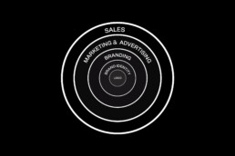
Imagine your brand as an onion, with each layer adding depth and flavor. At its core lies your logotype, its fundamental element. Every layer that surrounds this core will contribute different elements that, if done correctly, will help your brand succeed. Let’s dive into these layers.
1. Logo: The Tip of the Iceberg
Your logo is the visual cornerstone of your brand. It’s the first thing people see and the graphic element they associate with your business. While it’s just the tip of the iceberg, a well-designed logo is fundamental in initiating brand trust.
2. Brand Identity: Colors, Typography, Patterns, and More
Beyond the logo lies the broader spectrum of brand identity. This includes your brand’s colors, typography, patterns, and other visual elements like photography style. These elements work together to create a cohesive and memorable brand image that resonates with your audience.
3. Branding: Shaping Your Brand's Narrative
Branding is the process of crafting your brand’s story and identity. It includes your brand strategy, defining values, voice, personality, target audience, and market positioning. Additionally, branding extends to every touchpoint that shapes the brand experience, from how you communicate with customers to the sensory elements like smell, sight, and touch. Effective branding creates a strong emotional connection with your audience, turning them from customers to fans.
4. Marketing and Advertising: Amplifying Your Brand's Message
Once you’ve established your brand identity and strategy, it’s time to amplify your message through marketing and advertising. This includes strategies like content marketing, social media campaigns, and paid advertising, all aimed at reaching and engaging your target audience.
5. Sales: Converting Leads into Customers
The final layer of the brand-building process is sales. This is where all your branding and marketing efforts culminate in converting leads into customers. If your previous layers are well put together and you have a strong brand, the sales process can become smoother, as customers are already familiar and comfortable with your brand.
To finish this article, I’d like to point out the most crucial element, which I seem to have forgoten to mention: your product or service. While these 5 layers can help you attract more clients and build brand trust, if your offering isn’t top-notch, you might make a sale once, but that’s where it ends.
In conclusion, building a successful brand requires attention to each of these layers. From logo to marketing, to sales, each layer plays a crucial role in shaping your brand’s story and connecting with your audience. The more attention to detail and professionalism applied to each layer, the greater your brand’s chance of success.
What other aspects of brand management are you curious about?
Mariana and her team were fantastic to work with. Responsive, understanding, and organized. Most importantly the quality of the work is exceptional. I am tremendously proud to be represented by the branding that Design Etiquette created for my business.
Brandon Chillingworth — Hacked BD
The Death of Print: Myth or Reality?
— The Death of Print: Myth or Reality? — The Death of Print: Myth or Reality?
Branding, Business, Creativity
Is Print Really Dead?
A couple of months ago I was contacted by Idn Magazine, a design publication from Hong Kong. Their upcoming edition talks about brand identity, and more specifically business cards. I was thrilled to learn they wanted to feature our projects in their new edition and asked for my insights on the relevance of printed materials today. This email made my month and triggered a safari of ideas in my head.
“Print is dead!”. That’s what haters will say. For UI/UX designers and some business owners, printed materials have been dead for the past twenty years when social media started killing marketing and advertising as we knew it.
Twenty years sounds like a lot of time, but in retrospect, time can flow like water through your fingers, making two decades feel like yesterday. Social media and Web 2.0 transformed life in unimaginable ways, especially for a millennial like me, who has lived half in analog and half in digital, making me feel like I was born either too late or too early.
We millennials have lived a part of our lives with bicycles, cinemas, VHS, MTV, and uncensored bullying, which have been gradually replaced by smartphones, Netflix, Spotify, Uber, and fourth-place trophies.
Before social media, print was a thing: For breakfast, we didn’t scroll through our Facebook feed, we read the back of our cereal box or the newspaper. Cluttered catalogs have turned into e-commerce, and we’ve exchanged random flyers in the mail for hyper-targeted Meta ads. Thanks to social media and digital marketing, you can now connect with people around the clock, with a purpose and in a targeted way. The tables have turned making digital communication the new normal.
If you look around your house right now, chances are you won’t be able to find a flyer, coupon, business card, or brochure. Most of our books are digital. We take thousands of photos but only print one percent of them. Is print really dead?
My take on this is complex, and my opinion may not be popular. Right now I would compare print to one of Sookie Stackhouse’s lovers: a vampire that has been half-dead for the past ten years but is still handsome, elegant, clever, and thriving. It can sometimes look outdated and even creepy, but it can also be a beautiful rarity that can still hypnotize your customers. After all, we only print the best photos, buy the physical books when they are good enough for our library, and give out our spot-gloss business cards only to very important people.
Yes, digital is the new normal, but it is also saturated, much like printed communication was twenty years ago. Going old-school by printing a flyer for your business or sharing your brand story on the back of your packaging offers a golden opportunity worth exploiting. Today a well-designed packaging, brochure, or business card is a sexy vampire waiting to use its fangs on whoever has eyes to see.
Mariana and her team were fantastic to work with. Responsive, understanding, and organized. Most importantly the quality of the work is exceptional. I am tremendously proud to be represented by the branding that Design Etiquette created for my business.
Brandon Chillingworth — Hacked BD
Your Brand and Social Media
— Your Brand and Social Media — Your Brand and Social Media
Business, Marketing, Branding
The world we live in today is more connected than ever before, and social media (and a freaking pandemic) has played a big role in this.
With that said, having a good social media presence, and improving your digital marketing, can bring many advantages to your business:
Increased brand awareness and recognition:
Social media platforms allow you to reach a large and diverse audience cost-effectively. By consistently posting engaging content and interacting with your followers, you can build a strong online presence that can help attract new customers and retain existing ones.
Lead and sales generation:
With platforms like Instagram, Twitter, and TikTok, you have a direct line of communication with your target audience, making it easy to promote your products or services, as well as generate leads by directing potential customers to landing pages or sign-up forms.
Better customer service and engagement:
They help you provide customer service in a quick, easy, and personal way. It allows you to respond to customer complaints and issues quickly and efficiently, which can help improve customer satisfaction.
Market and customer research:
Improving your digital marketing and social media channels, allow your business to gather valuable data and insights about your users. Most platforms’ analytic tools can track engagement, demographics, and other insights that will help you understand your audience. This data can be used to optimize marketing strategies and improve your brand experience.
Cost-effective advertising:
Social media platforms offer cost-effective advertising options for businesses, allowing you to reach your target audience with precision, by targeting your customer’s demographics and interests.
Create a community:
Building relationships with customers on social media can help increase brand loyalty and customer retention. In today’s highly competitive market, customers are no longer solely motivated by product offerings and pricing. They are looking for deeper connections with brands and a sense of belonging to a like-minded community.
Leadership and customers’ top of mind:
These platforms allow brands to share their stories, expertise, and insights, positioning themselves as thought leaders in their market. Regularly posting valuable content can keep your business on your customers’ top of mind and build brand trust.
“If they haven’t posted in a while, I simply do not contact them”. That’s what one of my friends casually said at a party. I’m ending this article with that insightful quote because it illustrates greatly the way people perceive and interact with brands on social media, and how maintaining a consistent and active presence on these platforms can impact the success of a brand.
Mariana and her team were fantastic to work with. Responsive, understanding, and organized. Most importantly the quality of the work is exceptional. I am tremendously proud to be represented by the branding that Design Etiquette created for my business.
Brandon Chillingworth — Hacked BD
Your logo. Your flag.
— Your logo. Your flag. — Your logo. Your flag.
Creativity, Brand Strategy
I can’t remember how often clients have asked us to design a logo representing their brand values, history, niche, customers, believes, and strategy. Wait! What? No.
First, let’s start with the definition and function of a logo: A logo is a graphic element, symbol, or emblem used to identify a company, organization, or brand.
Is it possible to enclose all your brand information in this simple graphic? The answer is no. Instead, I try to explain to our clients that they should think of their logo as a country’s flag. And let me explain this analogy:
Pick a country, any country. Say, Costa Rica. Its flag has a simple blue, white and red stripe combo (similar to Thailand’s, but inverted). If you’ve never seen our flag, you won’t know what you are looking at. But if you have, you probably have an image associated with it: Nature, “Pura Vida”, Coffee, Keylor Navas, Gallo Pinto, Peace. All your associations go hand in hand with your life experiences and personal preferences.
The same thing happens with your logo. When people first see it, they are just going to see graphic elements (whether simple or complex, monochromatic or colorful). As people start interacting with your business, your logo takes on new meanings: great brand, good service, interesting company values, inspiring brand story. Your brand identity and marketing can give your customers an idea of what to expect from your product or service, but your logo alone, which is probably the first thing they interact with, can’t. If your business was a country, your logo is its flag.
Your secretary yelled at your client? Does your latest flavored frappuccino taste like kombucha? Did your flight attendant kick a passenger out of their flight? Many big brands have had a customer experience gone so bad and viral, that they’ve turned their logos into the equivalent of House Bolton’s sigil, making everyone run in the opposite direction when they see it. If you are not on top of your game, your logo could start having negative connotations: lousy customer service, cheap products, and unacceptable business policies. This is why it’s important to craft every aspect of your brand so that, in time, the associations that people have when seeing your logo, are good. Hopefully great.
So start thinking about your logo as your business flag, and start analyzing the associations people have about your brand when they see it. By doing this, you’ll find ways to improve your business and help your customers better. Your brand value, after all, is what they make of it.
Mariana and her team were fantastic to work with. Responsive, understanding, and organized. Most importantly the quality of the work is exceptional. I am tremendously proud to be represented by the branding that Design Etiquette created for my business.
Brandon Chillingworth — Hacked BD
Tips For Updating Your Brand
— Tips For Updating Your Brand — Tips For Updating Your Brand
Creativity, Marketing
Everything is in constant change. Nothing is static. Every minute we make decisions that modify our paths and shape our surroundings.
In every aspect of life you have to be constantly optimizing, changing and evolving. From cutting your hair and buying a new pair of shoes, to breaking bad habits and learning new skills. For a lot of people the meaning of life is to become the best version of ourselves (whatever “best” means to you), and this can only be achieved by improving everyday.
This also applies to your brand and business. From updating your company’s mission, to tweaking your marketing strategy, if you don’t befriend change, your company is going to be left behind, forgotten and, in many cases, broke. The companies that are thriving are the ones that embrace technology, trends and new ways of thinking.
So, how do you keep your business up to date? Here are some tips that can help you improve your brand, your marketing efforts and customer service.
1. EVALUATE YOUR WEBSITE:
In many cases, your website is the first channel of communication between your brand and your customer. Having a good platform and design shows people that you are on top of your game.
My tips to you:
• If your site is not responsive, please do everyone a favor and drop a bomb on it. In a world where approximately 44% of the population has an smart phone or tablet, your site is junk if it is designed for desktop only.
• If your website is more than three or four years old, hire an expert to optimize your design, platform and/or code: Web and design trends change everyday, and a website that looked amazing four years ago, might be slow and look outdated today.
• Make sure your site is user-friendly and glitch-free: Navigating through a site where you don’t know where to click is just sad, and it’s even worse if the site just doesn’t work.
2. REDESIGN OR TWEAK YOUR LOGO:
A logo should be timeless. In fact, I’m against creating logos that favor design trends or weird in-vogue typography. However, once in a while changing some details or redesigning it altogether can keep your brand looking fresh and contemporary.
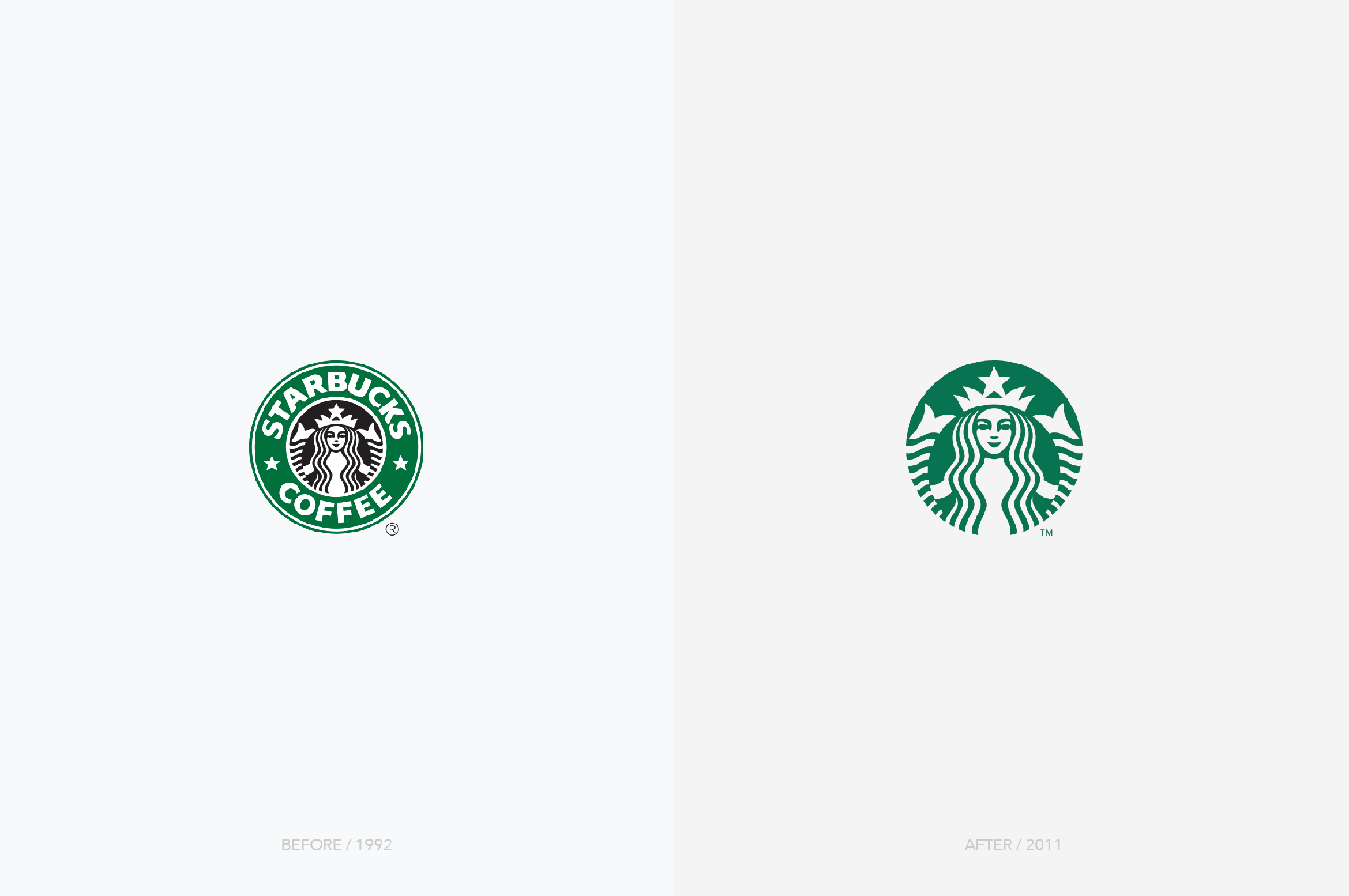
Rockstar designer, and partner at Pentagram, Paula Scher has said that she has redesigned a lot of well-known logos and the change has been so subtle that people didn’t notice the difference. In fact, most logos go through slight modifications that design muggles don’t easily perceive but that help the brand stay current.
You can see these little changes in the way the Starbucks logo has evolved through time:
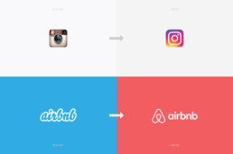
And yes, a logo can also have a major change, like the famous Instagram or Airbnb redesigns:
My tips to you:
• Evaluate your logo’s typography: A change in your logo’s typography is subtle and can make a big difference in the way people perceive your brand.
• Analyze your logo and market: Hire a designer to study your current branding and how it holds up against your competition.
3. KEEP AN EYE ON YOUR SOCIAL MEDIA ACCOUNTS:
Social media has changed the marketing and advertising game, it has modified the way we interact with our customers, and it is, not only more efficient than traditional advertisement, but also way cheaper.
My tips to you:
• Feed your feed: A friend of mine once said that she doesn’t hire a service if their Facebook business page doesn’t have recent posts. This was an amazing insight that blew my mind and that sounds right in today’s society. If you abandon your social media feeds, people might see your brand as lazy and careless. And yes, most companies, business owners and entrepreneurs don’t have the budget to hire a Community Manager, or the time and motivation to do it themselves, but at least try posting once or twice a month.
• Choose your Social Media accounts wisely: Your business doesn’t have to be active on every platform. Choose the network that works best for your target audience, and keep in mind that a Facebook user is completely different from an Instagram or TikTok user.
• Be consistent with your graphics: Communication is a 360 degree experience for your audience, that includes your social media platforms. Make sure you’re using the same fonts, colors, imagery and overall design quality along your accounts and marketing materials.
4. EXAMINE YOUR AUDIENCE:
Knowing your audience is one of the most important aspects of your business. You need to be able to step in their shoes: know who they are, what they like, what keeps them awake at night, their fears and dreams.
• My tips to you:
• Discover who your audience really is: There’s a big difference between our real and ideal customers. Find out who is really promoting and buying your products, and keep in mind that your audience might be different as time goes by.
• Create value: I love Gary Vaynerchuk. He is just a cool dude that gives intelligent advice for free. He believes that brands and individuals need to create value and develop a good communication with their audience. The days of taking are over: show your audience a little appreciation, let them know that you are listening, share your knowledge. Word of mouth, at the end of the day, is still the most powerful form of marketing.
Mariana and her team were fantastic to work with. Responsive, understanding, and organized. Most importantly the quality of the work is exceptional. I am tremendously proud to be represented by the branding that Design Etiquette created for my business.
Brandon Chillingworth — Hacked BD
Why Design Etiquette?
— Why Design Etiquette? — Why Design Etiquette?
Creativity, Brand Strategy
The french word etiquette refers to conventional forms and codes of conduct.
Whatchamacallit? That’s the most common question clients ask me when they are starting a new business and don’t know what to call it. This identity dilemma is like being pregnant and searching a thousand ugly websites for baby names, while nervously thinking about your name choice and how it will affect your son or daughter’s future. It’s worse if you’re looking for a brand name, because in the case of a brand, you cannot just call it John, or Paul, or Ringo, or George… Your brand’s name should be strategic in so many ways (that I will discuss in another post).
In 2009, when I decided to go bossless, I learned that in the realm of branding, this specific service is called “Naming”, and people pay Lannister gold for it. Since this was my first time as an entrepreneur and I didn’t have the money, I baptized my design studio.
I wanted a name that was unique and easy to understand no matter where you were in the world. I also wanted the name to be a reference to the clean and elegant designs that I wanted to create for my clients.
Design Etiquette: People either hate or love my name choice. There seems to be no middle ground for it, and according to “Hello, My Name is Awesome”, by Alexandra Watking, it’s not the best name either: it is hard to understand, hard to write, and for a lot of people (Siri included) hard to pronounce.
Maybe, it is a name that provokes a lot of mixed feelings because it is controversial: the french word etiquette, refers to conventional forms and codes of conduct, established conventions and good taste. This is when some people start asking themselves: Should design have dos and don’ts? Is there such a thing as creative decorum? I myself, think so.
In my early years as a designer I was led to believe that design was a divine talent granted to a few lucky hipsters. A wild spirit animal that you were either born with or not. In a sense, it was insinuated that colors, typography, patterns and graphic choices came from my intuition, not my knowledge or skills.
While studying a Master in Visual Design in Milan, Italy, I was relieved and delighted to learn that Italians treat design as a science, everything has to be in place, everything has to have an explanation. For them, design is methodical. Even though they are not as strict as the Swiss, Italians respect and take pride in their craftsmanship, and most of them —from a designer, to a chef, all the way to a barista— care about the little details of their occupation just like a good old artisan would. As much as they believe in the muse of creativity, they also know that in order to be good at what you do, you have to evolve your skills and learn from your superiors.
CREATIVITY WITHOUT STRATEGY, CONCEPTUALIZATION, AND EDUCATION IS JUST DULL.
The best designs, products, and buildings are created when creativity meets intention, talent, skills and strategy. Coming up with an idea just because –more often than not— is not enough, and going the extra mile, whether in education, precision, style or passion, is what makes a piece of wood an Eames, some concrete blocks a Zaha Hadid, and random letters a Jessica Heische. Even James Victore’s work, including his “Feck Perfuction”, contains a full dose of strategy, talent and passion.
So, if you ask me, design should have etiquette. There needs to be a balance between the magical side of creativity and the methodical side of our right-brained occupation. By doing so, I believe we’ll improve our craft, and increase the value and quality of our work.
