Mariana and her team were fantastic to work with. Responsive, understanding, and organized. Most importantly the quality of the work is exceptional. I am tremendously proud to be represented by the branding that Design Etiquette created for my business.
Brandon Chillingworth — Hacked BD
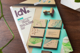
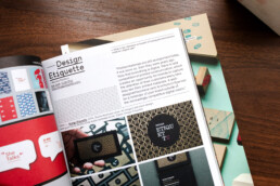
Our Work Featured in IdN World Magazine
— Our Work Featured in IdN World Magazine — Our Work Featured in IdN World Magazine
Publications
Print is not dead!
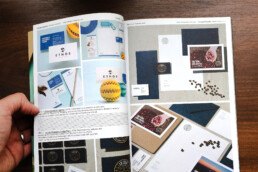
We’re thrilled to announce that our work has been showcased in the latest edition of IdN World Magazine (v28n4) all the way from Hong Kong!
This edition focuses on brand identity and business card design, featuring the outstanding work of talented designers and studios, as well as their points of view about business cards and print materials nowadays. We’re truly honored to be featured among them!
“Printed materials are still as important today, if not more so, than they were years ago. Now that everything is digital, there is less competition in printed communication, which creates an opportunity for brands to capture the attention of their customers every time they see their printed materials. A well-designed business card, brochure or flyer can be a reminder of your brand outside of the increasingly competitive digital matrix.“Printed materials are still as important today, if not more so, than they were years ago. Now that everything is digital, there is less competition in printed communication, which creates an opportunity for brands to capture the attention of their customers every time they see their printed materials. A well-designed business card, brochure or flyer can be a reminder of your brand outside of the increasingly competitive digital matrix.” —Mariana Pacheco
You can get a copy of the magazine here. and check out the online article here.
Mariana and her team were fantastic to work with. Responsive, understanding, and organized. Most importantly the quality of the work is exceptional. I am tremendously proud to be represented by the branding that Design Etiquette created for my business.
Brandon Chillingworth — Hacked BD
Our Work Featured in La Tina
— Our Work Featured in La Tina — Our Work Featured in La Tina
Publications
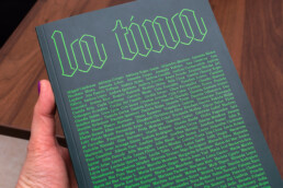
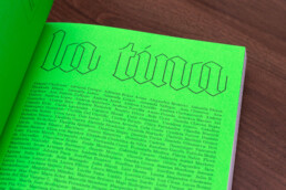
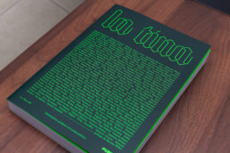
Celebrating 175 Inspiring Latin American Female Designers.
La Tina showcases the exceptional work of talented women designers from across Latin America, including our director, Mariana Pacheco. It is an honor to have our work alongside so many talented women.
Thank you Pupila for this amazing book and for celebrating design in our region.
Mariana and her team were fantastic to work with. Responsive, understanding, and organized. Most importantly the quality of the work is exceptional. I am tremendously proud to be represented by the branding that Design Etiquette created for my business.
Brandon Chillingworth — Hacked BD
Your Brand and Social Media
— Your Brand and Social Media — Your Brand and Social Media
Business, Marketing, Branding
The world we live in today is more connected than ever before, and social media (and a freaking pandemic) has played a big role in this.
With that said, having a good social media presence, and improving your digital marketing, can bring many advantages to your business:
Increased brand awareness and recognition:
Social media platforms allow you to reach a large and diverse audience cost-effectively. By consistently posting engaging content and interacting with your followers, you can build a strong online presence that can help attract new customers and retain existing ones.
Lead and sales generation:
With platforms like Instagram, Twitter, and TikTok, you have a direct line of communication with your target audience, making it easy to promote your products or services, as well as generate leads by directing potential customers to landing pages or sign-up forms.
Better customer service and engagement:
They help you provide customer service in a quick, easy, and personal way. It allows you to respond to customer complaints and issues quickly and efficiently, which can help improve customer satisfaction.
Market and customer research:
Improving your digital marketing and social media channels, allow your business to gather valuable data and insights about your users. Most platforms’ analytic tools can track engagement, demographics, and other insights that will help you understand your audience. This data can be used to optimize marketing strategies and improve your brand experience.
Cost-effective advertising:
Social media platforms offer cost-effective advertising options for businesses, allowing you to reach your target audience with precision, by targeting your customer’s demographics and interests.
Create a community:
Building relationships with customers on social media can help increase brand loyalty and customer retention. In today’s highly competitive market, customers are no longer solely motivated by product offerings and pricing. They are looking for deeper connections with brands and a sense of belonging to a like-minded community.
Leadership and customers’ top of mind:
These platforms allow brands to share their stories, expertise, and insights, positioning themselves as thought leaders in their market. Regularly posting valuable content can keep your business on your customers’ top of mind and build brand trust.
“If they haven’t posted in a while, I simply do not contact them”. That’s what one of my friends casually said at a party. I’m ending this article with that insightful quote because it illustrates greatly the way people perceive and interact with brands on social media, and how maintaining a consistent and active presence on these platforms can impact the success of a brand.
Mariana and her team were fantastic to work with. Responsive, understanding, and organized. Most importantly the quality of the work is exceptional. I am tremendously proud to be represented by the branding that Design Etiquette created for my business.
Brandon Chillingworth — Hacked BD
Our Work Featured in Logo Lounge 13
— Our Work in Logo Lounge 13 — Our Work in Logo Lounge 13
Creativity, Publications
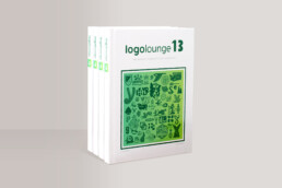
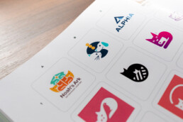
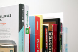
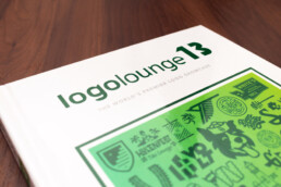
We are so excited to have one of our logos chosen for this year’s Logo Lounge 13.
With 36,000 submissions and only 3,000 logos chosen, this book’s packed with incredible logo designs from around the world. Logo Lounge has been a source of inspiration for our work throughout the years, and we couldn’t be more honored to have our work in it.
Mariana and her team were fantastic to work with. Responsive, understanding, and organized. Most importantly the quality of the work is exceptional. I am tremendously proud to be represented by the branding that Design Etiquette created for my business.
Brandon Chillingworth — Hacked BD
Your logo. Your flag.
— Your logo. Your flag. — Your logo. Your flag.
Creativity, Brand Strategy
I can’t remember how often clients have asked us to design a logo representing their brand values, history, niche, customers, believes, and strategy. Wait! What? No.
First, let’s start with the definition and function of a logo: A logo is a graphic element, symbol, or emblem used to identify a company, organization, or brand.
Is it possible to enclose all your brand information in this simple graphic? The answer is no. Instead, I try to explain to our clients that they should think of their logo as a country’s flag. And let me explain this analogy:
Pick a country, any country. Say, Costa Rica. Its flag has a simple blue, white and red stripe combo (similar to Thailand’s, but inverted). If you’ve never seen our flag, you won’t know what you are looking at. But if you have, you probably have an image associated with it: Nature, “Pura Vida”, Coffee, Keylor Navas, Gallo Pinto, Peace. All your associations go hand in hand with your life experiences and personal preferences.
The same thing happens with your logo. When people first see it, they are just going to see graphic elements (whether simple or complex, monochromatic or colorful). As people start interacting with your business, your logo takes on new meanings: great brand, good service, interesting company values, inspiring brand story. Your brand identity and marketing can give your customers an idea of what to expect from your product or service, but your logo alone, which is probably the first thing they interact with, can’t. If your business was a country, your logo is its flag.
Your secretary yelled at your client? Does your latest flavored frappuccino taste like kombucha? Did your flight attendant kick a passenger out of their flight? Many big brands have had a customer experience gone so bad and viral, that they’ve turned their logos into the equivalent of House Bolton’s sigil, making everyone run in the opposite direction when they see it. If you are not on top of your game, your logo could start having negative connotations: lousy customer service, cheap products, and unacceptable business policies. This is why it’s important to craft every aspect of your brand so that, in time, the associations that people have when seeing your logo, are good. Hopefully great.
So start thinking about your logo as your business flag, and start analyzing the associations people have about your brand when they see it. By doing this, you’ll find ways to improve your business and help your customers better. Your brand value, after all, is what they make of it.
Mariana and her team were fantastic to work with. Responsive, understanding, and organized. Most importantly the quality of the work is exceptional. I am tremendously proud to be represented by the branding that Design Etiquette created for my business.
Brandon Chillingworth — Hacked BD
We won a silver LAD Awards
— We won a silver LAD Awards — We won a silver LAD Awards
Awards, Publications
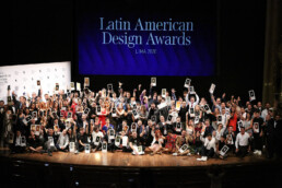
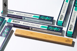
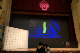
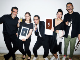
We are excited to announce that Design Etiquette has won a silver award at the Latin American Design Awards, the most important design competition in Latin America!
The LAD Awards celebrates the best of design from around the region with some of the biggest studios awarded. The jury is made up of leading designers in their field. We strive to be excellent at our craft, delivering high-end design solutions for our clients, and it is an honor for us to be recognized among our peers and alongside other studios, we respect and admire. This award will inspire us to continue pushing the boundaries and help make the world a better place with design.

Mariana and her team were fantastic to work with. Responsive, understanding, and organized. Most importantly the quality of the work is exceptional. I am tremendously proud to be represented by the branding that Design Etiquette created for my business.
Brandon Chillingworth — Hacked BD
Our Work Featured in Logo Lounge 11
— Our Work in Logo Lounge 11 — Our Work in Logo Lounge 11
Creativity, Publications
“Your work is being featured in the design books you used to devour when we were in school. How cool is that?”
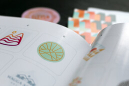
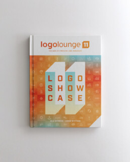
That’s what a friend of mine pointed out the other day (although I guess she wouldn’t use a word like “devour”, but you get the point). I hadn’t thought about it this way until she mentioned it, and yes it does feel cool. I have about half the books of the Logo Lounge collection, and even though I have never thought about submitting my own work until now, this year two of our logos got picked out of 40,000 submissions to be included in their new book.
It feels great to have our work next to other designers we admire, this is enough motivation to keep us creating the best work we can. The Logo Lounge books are well-curated and a great source of inspiration for any brand designer. You can get this issue and some of their past books on Amazon and other design stores.
Mariana and her team were fantastic to work with. Responsive, understanding, and organized. Most importantly the quality of the work is exceptional. I am tremendously proud to be represented by the branding that Design Etiquette created for my business.
Brandon Chillingworth — Hacked BD
Tips For Updating Your Brand
— Tips For Updating Your Brand — Tips For Updating Your Brand
Creativity, Marketing
Everything is in constant change. Nothing is static. Every minute we make decisions that modify our paths and shape our surroundings.
In every aspect of life you have to be constantly optimizing, changing and evolving. From cutting your hair and buying a new pair of shoes, to breaking bad habits and learning new skills. For a lot of people the meaning of life is to become the best version of ourselves (whatever “best” means to you), and this can only be achieved by improving everyday.
This also applies to your brand and business. From updating your company’s mission, to tweaking your marketing strategy, if you don’t befriend change, your company is going to be left behind, forgotten and, in many cases, broke. The companies that are thriving are the ones that embrace technology, trends and new ways of thinking.
So, how do you keep your business up to date? Here are some tips that can help you improve your brand, your marketing efforts and customer service.
1. EVALUATE YOUR WEBSITE:
In many cases, your website is the first channel of communication between your brand and your customer. Having a good platform and design shows people that you are on top of your game.
My tips to you:
• If your site is not responsive, please do everyone a favor and drop a bomb on it. In a world where approximately 44% of the population has an smart phone or tablet, your site is junk if it is designed for desktop only.
• If your website is more than three or four years old, hire an expert to optimize your design, platform and/or code: Web and design trends change everyday, and a website that looked amazing four years ago, might be slow and look outdated today.
• Make sure your site is user-friendly and glitch-free: Navigating through a site where you don’t know where to click is just sad, and it’s even worse if the site just doesn’t work.
2. REDESIGN OR TWEAK YOUR LOGO:
A logo should be timeless. In fact, I’m against creating logos that favor design trends or weird in-vogue typography. However, once in a while changing some details or redesigning it altogether can keep your brand looking fresh and contemporary.
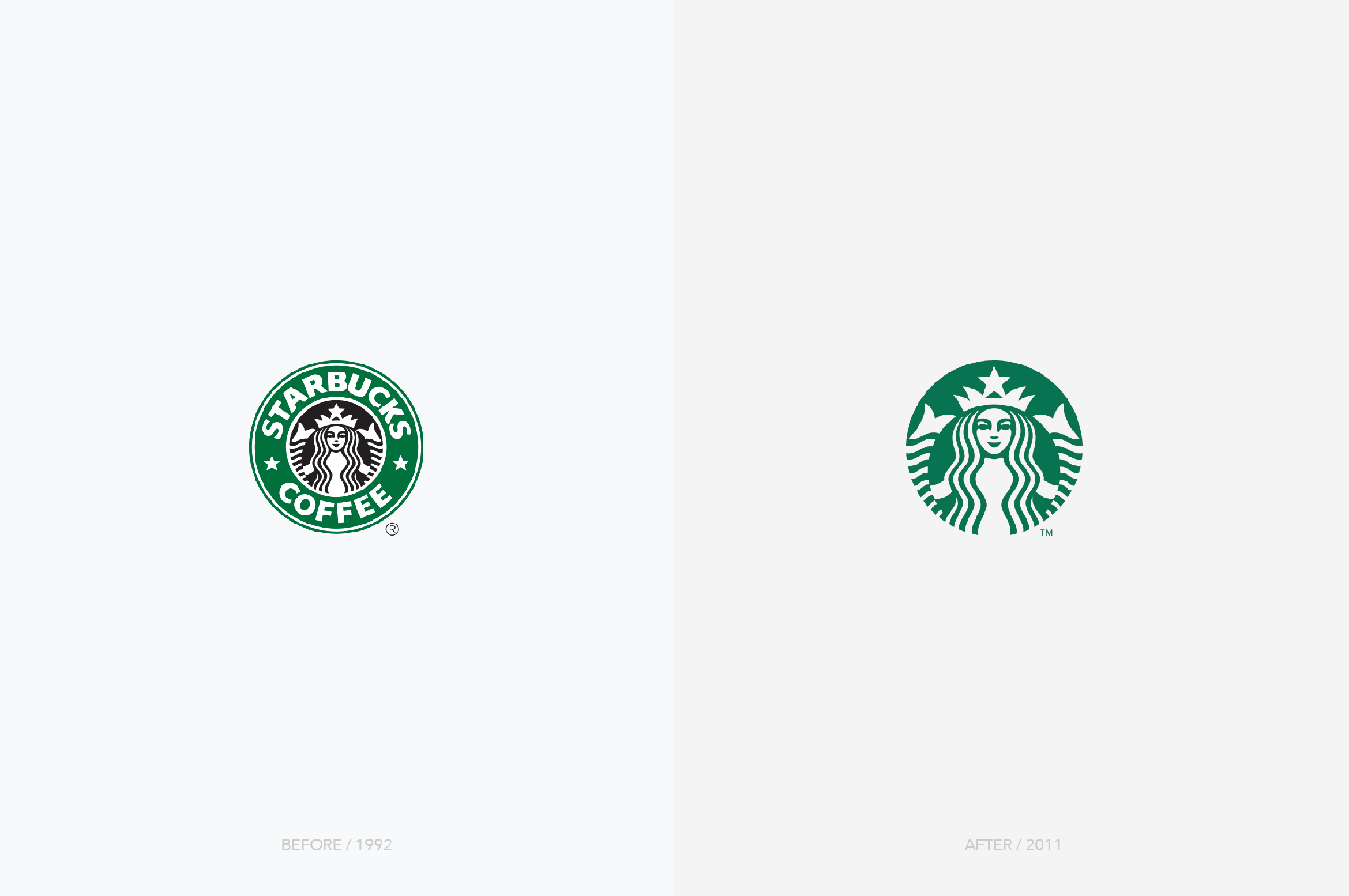
Rockstar designer, and partner at Pentagram, Paula Scher has said that she has redesigned a lot of well-known logos and the change has been so subtle that people didn’t notice the difference. In fact, most logos go through slight modifications that design muggles don’t easily perceive but that help the brand stay current.
You can see these little changes in the way the Starbucks logo has evolved through time:
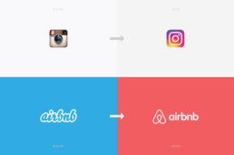
And yes, a logo can also have a major change, like the famous Instagram or Airbnb redesigns:
My tips to you:
• Evaluate your logo’s typography: A change in your logo’s typography is subtle and can make a big difference in the way people perceive your brand.
• Analyze your logo and market: Hire a designer to study your current branding and how it holds up against your competition.
3. KEEP AN EYE ON YOUR SOCIAL MEDIA ACCOUNTS:
Social media has changed the marketing and advertising game, it has modified the way we interact with our customers, and it is, not only more efficient than traditional advertisement, but also way cheaper.
My tips to you:
• Feed your feed: A friend of mine once said that she doesn’t hire a service if their Facebook business page doesn’t have recent posts. This was an amazing insight that blew my mind and that sounds right in today’s society. If you abandon your social media feeds, people might see your brand as lazy and careless. And yes, most companies, business owners and entrepreneurs don’t have the budget to hire a Community Manager, or the time and motivation to do it themselves, but at least try posting once or twice a month.
• Choose your Social Media accounts wisely: Your business doesn’t have to be active on every platform. Choose the network that works best for your target audience, and keep in mind that a Facebook user is completely different from an Instagram or TikTok user.
• Be consistent with your graphics: Communication is a 360 degree experience for your audience, that includes your social media platforms. Make sure you’re using the same fonts, colors, imagery and overall design quality along your accounts and marketing materials.
4. EXAMINE YOUR AUDIENCE:
Knowing your audience is one of the most important aspects of your business. You need to be able to step in their shoes: know who they are, what they like, what keeps them awake at night, their fears and dreams.
• My tips to you:
• Discover who your audience really is: There’s a big difference between our real and ideal customers. Find out who is really promoting and buying your products, and keep in mind that your audience might be different as time goes by.
• Create value: I love Gary Vaynerchuk. He is just a cool dude that gives intelligent advice for free. He believes that brands and individuals need to create value and develop a good communication with their audience. The days of taking are over: show your audience a little appreciation, let them know that you are listening, share your knowledge. Word of mouth, at the end of the day, is still the most powerful form of marketing.
Mariana and her team were fantastic to work with. Responsive, understanding, and organized. Most importantly the quality of the work is exceptional. I am tremendously proud to be represented by the branding that Design Etiquette created for my business.
Brandon Chillingworth — Hacked BD
Why Design Etiquette?
— Why Design Etiquette? — Why Design Etiquette?
Creativity, Brand Strategy
The french word etiquette refers to conventional forms and codes of conduct.
Whatchamacallit? That’s the most common question clients ask me when they are starting a new business and don’t know what to call it. This identity dilemma is like being pregnant and searching a thousand ugly websites for baby names, while nervously thinking about your name choice and how it will affect your son or daughter’s future. It’s worse if you’re looking for a brand name, because in the case of a brand, you cannot just call it John, or Paul, or Ringo, or George… Your brand’s name should be strategic in so many ways (that I will discuss in another post).
In 2009, when I decided to go bossless, I learned that in the realm of branding, this specific service is called “Naming”, and people pay Lannister gold for it. Since this was my first time as an entrepreneur and I didn’t have the money, I baptized my design studio.
I wanted a name that was unique and easy to understand no matter where you were in the world. I also wanted the name to be a reference to the clean and elegant designs that I wanted to create for my clients.
Design Etiquette: People either hate or love my name choice. There seems to be no middle ground for it, and according to “Hello, My Name is Awesome”, by Alexandra Watking, it’s not the best name either: it is hard to understand, hard to write, and for a lot of people (Siri included) hard to pronounce.
Maybe, it is a name that provokes a lot of mixed feelings because it is controversial: the french word etiquette, refers to conventional forms and codes of conduct, established conventions and good taste. This is when some people start asking themselves: Should design have dos and don’ts? Is there such a thing as creative decorum? I myself, think so.
In my early years as a designer I was led to believe that design was a divine talent granted to a few lucky hipsters. A wild spirit animal that you were either born with or not. In a sense, it was insinuated that colors, typography, patterns and graphic choices came from my intuition, not my knowledge or skills.
While studying a Master in Visual Design in Milan, Italy, I was relieved and delighted to learn that Italians treat design as a science, everything has to be in place, everything has to have an explanation. For them, design is methodical. Even though they are not as strict as the Swiss, Italians respect and take pride in their craftsmanship, and most of them —from a designer, to a chef, all the way to a barista— care about the little details of their occupation just like a good old artisan would. As much as they believe in the muse of creativity, they also know that in order to be good at what you do, you have to evolve your skills and learn from your superiors.
CREATIVITY WITHOUT STRATEGY, CONCEPTUALIZATION, AND EDUCATION IS JUST DULL.
The best designs, products, and buildings are created when creativity meets intention, talent, skills and strategy. Coming up with an idea just because –more often than not— is not enough, and going the extra mile, whether in education, precision, style or passion, is what makes a piece of wood an Eames, some concrete blocks a Zaha Hadid, and random letters a Jessica Heische. Even James Victore’s work, including his “Feck Perfuction”, contains a full dose of strategy, talent and passion.
So, if you ask me, design should have etiquette. There needs to be a balance between the magical side of creativity and the methodical side of our right-brained occupation. By doing so, I believe we’ll improve our craft, and increase the value and quality of our work.
Mariana and her team were fantastic to work with. Responsive, understanding, and organized. Most importantly the quality of the work is exceptional. I am tremendously proud to be represented by the branding that Design Etiquette created for my business.
Brandon Chillingworth — Hacked BD
Not Just a Label
— Not Just a Label — Not Just a Label
Creativity, Packaging Design
How the design of a bottle label changed the history of Iceland’s most iconic drink.
Some years ago I met a group of friendly, and good looking, people from Iceland. They bragged about their pure water resources, wild horses, volcanoes, and beautiful country, while I bragged about Costa Rica’s nature, wild monkeys, volcanoes, and beautiful country. During our time together we shared and compared different parts of our culture: photos, believes, legends, food and drinks. Conversations turned into a passionate fight of Tuleviejas vs Trolls, Gallo Pinto vs Hakarl, and Guaro vs Brennivin.
Brennivin, that’s the name of Iceland’s famous drink, a liquor made out of potato and caraway (and don’t ask me what caraway is) that contains 37.5% alcohol, therefore its nickname “Black Death”. Design legend has it that around 1935 the government tried to make the bottle label less appealing in order to dissuade Icelanders from consuming alcohol. Their new black and white redesign caused the total opposite: sales skyrocket and, to this day, the drink with its beautiful and simple label still gives people the worst hangovers.
As a passionate designer, I kept the bottle as a souvenir of the great time I had, and as a reminder of the power that design has over a product, brand, and even the collective conscience of a country.
Cheers to good design and delicious Brennivin!
