Mariana and her team were fantastic to work with. Responsive, understanding, and organized. Most importantly the quality of the work is exceptional. I am tremendously proud to be represented by the branding that Design Etiquette created for my business.
Brandon Chillingworth — Hacked BD
The Beatles, Branding & Lasting Impact
— The Beatles, Branding & Lasting Impact — The Beatles, Branding & Lasting Impact
Branding, Brand Identity, Strategy
Imagine waking up in a world where The Beatles never existed. No ‘Hey Jude,’ no ‘Let It Be,’ no Abbey Road crosswalk photo.
Jack is a struggling singer from the UK. One day, he wakes up to find the world in total chaos after a solar flash sends civilization into panic.
That afternoon, he grabs his guitar and meets his friends for a Sunday picnic in the park. He starts singing:
“Yesterday, all my troubles seemed so far away,
Now it looks as though they’re here to stay…”
His friends stare at him, shocked. That’s the best song he has ever written. Tears start running down their cheeks as he finishes.
Jack laughs, thinking they’re being sarcastic, until he realizes they’re dead serious. They have no idea who John, Paul, George, or Ringo are.
As the days pass, he discovers that the solar flash has erased parts of everyday life. He now lives in an alternate world where Coca-Cola doesn’t exist. You can go to a Coldplay concert, but Oasis? That’s just water in the desert. And The Beatles? They were never a band.
So Jack starts recreating their songs from memory. Half-finished versions of Hey Jude, Yellow Submarine, and Let It Be become his songs.
This is the premise of Yesterday, a film that imagines a world without the Liverpool legends. It’s funny, smart, and leaves you thinking long after it’s over.
Ask yourself: What person, brand, or experience has made your life better? The one that, if erased in some alternate dimension, would leave a noticeable void?
I have my favorite people and brands; the ones I read, listen to, or engage with every day. And then there are a select few I’d truly miss if they disappeared. Life just wouldn’t be as exciting without them.
For many in Yesterday, that was The Beatles. Life just sounded better with their songs.
This movie made me wonder: What impact are we leaving on this world?
Are you influencing someone, even just 1%, the way The Beatles did? Whose life are you making better? Who would genuinely feel your absence?
And in business terms, is your brand or product truly making a difference in people’s lives?
Because that’s what we should all strive for, creating something so meaningful, so impactful, that if it disappeared, people would actually miss it.
That’s the power of great creativity.
Mariana and her team were fantastic to work with. Responsive, understanding, and organized. Most importantly the quality of the work is exceptional. I am tremendously proud to be represented by the branding that Design Etiquette created for my business.
Brandon Chillingworth — Hacked BD
Is Your Brand a Gordon Ramsay Meme?
— Is Your Brand Turning Into a Gordon Ramsay Meme? — Is Your Brand Turning Into a Gordon Ramsay Meme?
Branding, Brand Identity, Strategy
Doing this is the quickest way to destroy your brand and the slowest way to grow your business:
Creating a brand isn’t just about creating a logo or putting together a website. It’s about crafting an unforgettable story, building brand awareness, and creating a connection with your audience.
But here’s where many businesses go wrong: They invest thousands into creating their brand identity, only to hand off their brand’s management to someone who doesn’t fully understand what they’re doing.
Think of branding like high-end cooking.
You hire a world-star chef like Gordon Ramsay to craft a perfectly cooked 5-star Michelin dish, then you hand the recipe off to someone who lacks the skill and knowledge, like your friend from highschool who thinks he’s a chef because he cooks BBQ every Sunday afternoon.
Even though he has the recipe, the dish is a complete fail. It doesn’t have the right flavors, the presentation is sloppy. The magic? Gone. That’s what happens when a business hands off its brand to someone who doesn’t understand design and marketing fundamentals.

When a low-skilled designer takes over a brand, the core identity gets diluted. You’ll start noticing fonts that were never in your brand book, colors that seem just a little off, (believe it or not, there is a ton of technical skills that go into color management) and visuals that scream ‘DIY.’ Suddenly, the polished, cohesive brand you invested in starts feeling cheap, like a five-star meal that’s turned into a Gordon Ramsay meme.
Consistency is everything in branding. Making this gap in skillset your brand’s nemesis.
When you maintain a consistent identity, customers begin to trust you, and that trust builds loyalty. A great branding agency creates a comprehensive style guide that defines everything from colors to tone of voice to design principles. When you have a solid guide, your branding team can stay on track, and your business can continue to evolve without losing its identity.
To keep your initial brand identity and strategy from falling into oblivion, here are a few actions you can take:
- Build a crystal-clear style guide with your agency, a.k.a your brand book. A brand book isn’t just a document; it’s your brand’s bible. It ensures that everyone, internally and externally, is on the same page.
- Train your team on your brand’s ‘dos’ and ‘don’ts.’ Ensure everyone knows how to speak and present your brand consistently.
- Keep your branding team close. Invest in the best professionals that fit your budget, and keep them on retainer for as long as possible. A long-term partnership ensures your brand stays consistent, evolves with your business, and thrives.
Your brand is your business’s first impression. Don’t let shortcuts or budgets destroy the investment you’ve made.
What’s your biggest challenge with keeping your branding consistent? Let’s talk.
Mariana and her team were fantastic to work with. Responsive, understanding, and organized. Most importantly the quality of the work is exceptional. I am tremendously proud to be represented by the branding that Design Etiquette created for my business.
Brandon Chillingworth — Hacked BD
10 Branding Tips for Business Growth
— 10 Branding Tips for Business Growth — 10 Branding Tips for Business Growth
Branding, Brand Identity, Strategy
This took me 14 years as a brand designer to learn, I’ll teach it to you in 3 minutes.
Branding is constantly evolving, but there are certain principles that will always hold true. After 14 years of building brands and seeing what works, I’ve wrote down the most important elements of successful branding. If you’re looking to build a strong, memorable brand, here’s what you need to know:
1. Clarity Is King:
Your brand needs to be clear and easy to understand for your audience. If people don’t get it, they won’t buy it.
- Be clear on your offer: Make sure your audience knows exactly what you’re selling.
- Keep things simple: Don’t overcomplicate your messaging.
- Create systems: Simplify your processes to help customers quickly understand how to engage with you.
- Make your marketing straightforward: Focus on simplicity to boost your impact.
2. Make Your Offer Irresistible:
Your offer should feel like a no-brainer, making it impossible for your audience to say no.
- Sell the dream outcome, not just your service: Focus on the result you provide, not just the features.
- Use guarantees to minimize risk: Make customers feel safe to take action.
- Stack bonuses to amplify value: Offer extra perks that make the deal even better.
- Make buying frictionless: Remove any barriers to purchase.
3. Know Your Customer:
Building a brand is much easier when you truly understand who you’re speaking to.
- Get to know them by asking questions: Take the time to understand your audience’s needs and desires.
- Identify their biggest pain points: Understand what keeps them up at night.
- Speak their language: Use language and messaging that resonates with them.
- Solve their problems better than the competition: Show how your brand can uniquely meet their needs.
4. Start with Strategy:
Without a solid strategy, your brand will lack direction and focus.
- Define your brand’s positioning and unique value: What sets you apart from competitors?
- Understand your market: Know the trends and the competition.
- Set clear goals for growth: Establish measurable objectives for your brand.
- Build a brand that drives results: Focus on outcomes that contribute to long-term success.
5. Your Brand Identity Is Not Just a Logo:
Your logo is just the start. Your brand is much deeper and more complex.
- Create a complete visual identity: Color, typography, patterns, marketing assets.
- Define your brand’s personality: What values does your brand embody?
- Maintain consistency across all communication: Whether it’s on your website, social media, or packaging, stay aligned.
- Focus on user experience, not just visuals: Your brand should feel right at every touchpoint.
6. You Need 7 Touchpoints Before Making a Sale:
Building trust takes time. On average, you need several interactions before a customer is ready to buy.
- Show up consistently across multiple platforms: Be where your audience is, consistently.
- Educate users about your brand: Provide value through informative content.
- Facts tell, but stories sell: Nowadays storytelling is everything.
- Nurture leads until they’re ready to buy: Stay connected and keep building trust.
7. Branding Is the Act of Building a Brand:
Branding is a continuous process. It’s not just something you do once and forget about—it’s an ongoing effort.
- Build relationships: Your brand is about people, not just products.
- Create an emotional connection with your audience: The best brands evoke feelings and loyalty.
- Deliver a consistent experience every time: From first contact to repeat business, consistency is key.
- Invest in long-term brand value: Branding is an investment in the future of your business.
8. Consistency Builds Trust:
Your audience needs to see and hear the same message repeatedly to build trust.
- Stay consistent in your messaging and design: Everything should align with your brand.
- Show up regularly: Your audience needs to see you frequently to build recognition.
- Reinforce your brand values in everything you do: Make sure your actions match your words.
- Keep delivering on your promises: Trust comes from reliability.
9. Mindset Is Everything:
Your beliefs shape your success.
- Confidence attracts clients: Show up with belief in what you offer.
- Learn from failures and keep going: Every setback is an opportunity to grow.
- Surround yourself with positive people: Build a network of like-minded individuals who encourage growth.
- Take action every day: Momentum compounds over time.
10. Rebranding Can Be the Answer to Business Growth:
A fresh brand identity can be the key to unlocking new opportunities.
- Resonate better with your ideal customers: Sometimes, a shift in messaging or visuals is all it takes.
- Adapt to the times: If your brand isn’t keeping up, it’s time for a change.
- Stand out in a crowded market: Rebranding helps you break through the noise.
- Reinvent your brand to reflect new values, goals, or offerings: Your brand should evolve as your business does.
Want to Build a Stronger Brand or Website?
Let’s talk: Schedule a free discovery call.
Mariana and her team were fantastic to work with. Responsive, understanding, and organized. Most importantly the quality of the work is exceptional. I am tremendously proud to be represented by the branding that Design Etiquette created for my business.
Brandon Chillingworth — Hacked BD
Brand Colors for Health-Focused Brands
— Brand Colors for Health-Focused Brands — Brand Colors for Health-Focused Brands
Branding, Packaging, Strategy
Why Colors Matter for Health Brands: A Guide to Choosing the Right Palette
When it comes to branding for health brands, colors are more than just an aesthetic choice — they play a powerful role in shaping how customers feel about your brand. In fact, the colors you choose can influence perceptions and even build trust, especially if your brand focuses on health, wellness, or natural products.
Why Color Matters for Health Brands
Health brands have a unique mission: to communicate trust, cleanliness, and commitment to natural or high-quality ingredients. Choosing a color palette that resonates with these values is essential for creating an emotional connection with health-conscious customers.
While typical food brands might use bold colors like reds, yellows, and oranges to create a sense of energy or excitement, these colors are often associated with heavily processed or fast foods. Health brands usually go in a different direction to highlight their focus on wellness and purity.
Best Colors for Health Brands
So, what colors should health brands use? Here are some popular choices and the messages they convey:
- Greens: Green is a popular choice for health brands because it represents nature, freshness, and health. This color can help communicate that your brand uses natural ingredients or promotes sustainability.
- Earth Tones: Browns, beiges, and other earthy colors are also common in branding for health brands. These tones convey simplicity, wholesomeness, and a close connection to nature.
- Soft Blues and Whites: For brands in the wellness or medical space, soft blues and whites can add a sense of calm, purity, and professionalism.
How Colors and Typography Work Together
Beyond color, the typography and packaging for health brands also play a key role. Where regular food products might use bold, chunky typography, health brands often benefit from more delicate, clean typefaces that convey simplicity and authenticity.
By combining a soft color palette with subtle typography, your brand can create a cohesive look that communicates trustworthiness, aligns with health-conscious values, and makes your products easily recognizable on the shelf.
Tips for Creating Impactful Packaging for Health Brands
- Prioritize Color Psychology: Choose colors that reflect the values of your health brand. Think about the feelings you want to evoke in your customers — calmness, purity, and trustworthiness are great goals for health brands.
- Consider Your Audience: Health-conscious consumers are looking for brands they can trust. Using natural tones and simple design elements in your packaging can make your brand feel more genuine.
- Consistency is Key: Be consistent with your color choices across all branding, from packaging to website and social media. This creates a recognizable brand identity that builds trust over time.
In today’s market, branding for health brands goes beyond the product itself — it’s about creating an experience and a relationship with your audience. By carefully selecting the right colors and packaging elements, health brands can connect with their target customers, build loyalty, and stand out in a crowded market.
Need help with color selection or packaging for your health brand? Our team can help create a unique brand identity that resonates with your audience and sets you apart.
Mariana and her team were fantastic to work with. Responsive, understanding, and organized. Most importantly the quality of the work is exceptional. I am tremendously proud to be represented by the branding that Design Etiquette created for my business.
Brandon Chillingworth — Hacked BD
When To Rebrand
— When To Rebrand — When To Rebrand— When To Rebrand
Branding, Strategy, Business
Did you know that a rebrand can make or break your brand?
A brand redesign is a significant step. Here are some reasons why your business might need a rebrand or brand refresh:
1. Poorly Executed Brand Identity:
Maybe you didn’t invest in a high-quality brand identity from the start, or perhaps the designer or studio you worked with missed the mark. Now that your brand is more established and generating revenue, it might be time to hire a skilled professional to redesign your brand identity.
Ex: Starbucks
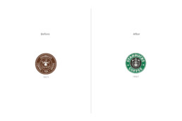
Starbucks’ logo was such an ugly baby that the company decided to simplify and modernize it in 1987, transforming the siren into a cleaner, less-detailed image. They also chose their famous green color to stand out in a market full of browns. This evolution helped Starbucks align with modern aesthetics and appeal to a broader audience.
2. Outdated Brand Image:
Brand identities should be timeless, but if yours feels outdated, it’s time for a refresh to stay relevant and modern.
Ex: Firefox
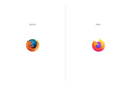
Mozilla Firefox’s logo had been tweaked slightly over the years, but by 2019, the classic fox circling the globe began to look outdated, especially with the rise of flat design trends. The company rebranded with a more abstract, simplified version of the logo, retaining the essence of the fox but using bold, vibrant colors that better fit modern design aesthetics.
3. Expansion or Diversification:
If your business expands into new markets or offers new products/services, rebranding can help communicate these changes effectively.
Ex: Amazon
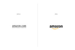
Amazon started in 1994 as an online bookstore, with a logo that reflected its focus on books. However, as the company expanded into selling a wide range of products—from electronics to groceries—and eventually evolved into a global e-commerce giant, a rebrand was necessary. In 2000, Amazon introduced its now-famous logo featuring an arrow curving from the “A” to the “Z,” symbolizing the company’s shift to selling “everything from A to Z.”, reflecting its growing product diversity.
4. Mergers or Acquisitions:
After a merger or acquisition, rebranding can help unify the brand identity of the new business. This process goes beyond aesthetic changes, aiming to establish a new brand that resonates with customers, employees, and stakeholders.
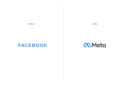
Ex: Meta
Facebook rebranded as Meta in 2021 to signify its shift from being just a social media company to focusing on building the metaverse. This change unified the company’s different platforms (Facebook, Instagram, WhatsApp, etc.) under one new identity.
5. Negative Perception:
If your brand has faced negative publicity or has gained a bad reputation, rebranding can help rebuild trust and improve perception. It’s a dirty move, but someone’s gotta do it.
Ex: Uber
After facing negative publicity due to internal issues and public controversies, Uber rebranded in 2018 with a new, friendlier logo and visual identity.

6. Innovation or Evolution:
As your business grows & adapts, there might be changes in your offerings or values.
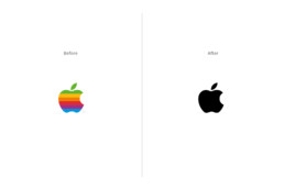
Ex: Apple
Although Apple hasn’t drastically changed its logo, the brand has consistently refreshed its identity to match its evolution as a tech innovator. From the rainbow-colored apple to a sleeker monochrome design, the brand reflects modernity and cutting-edge innovation as it continues to grow.
7. Changes in Name:
Whether you are changing your business name because it is difficult to pronounce, or because of Trademark conflict, a change in your brand identity is needed.
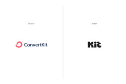
Ex: Kit
Recently, ConvertKit changed its name to simply ‘Kit,’ which I believe will benefit the brand immensely. The name change reflects their evolution from an email marketing tool into a broader creator-focused platform. Alongside the new name, they launched a refreshed brand identity that looks more modern and friendly, aligning perfectly with their mission to empower creators with simple and effective tools.
Is it time for your brand to evolve? Let’s explore how a fresh perspective can enhance your identity and impact.
Schedule a free discovery call today, and let’s talk about your business!
Mariana and her team were fantastic to work with. Responsive, understanding, and organized. Most importantly the quality of the work is exceptional. I am tremendously proud to be represented by the branding that Design Etiquette created for my business.
Brandon Chillingworth — Hacked BD
Key Traits That Set Great Coffee Brands Apart
— Key Traits That Set Great Coffee Brands Apart — Key Traits That Set Great Coffee Brands Apart
Branding, Packaging, Business
Ever since its origins, coffee has become one of the world’s favorite drinks, and the most consumed next to water. The global coffee market is huge, with millions of people involved in its production, trade, and retail. Your local supermarket is filled with different varieties: whole bean, ground, light roast, dark roast, and production processes: honey, anaerobic, and natural. You can find a coffee shop in any city around the world, with different prices and experiences: the good, the bad, and the ugly.
Some people might argue that coffee is the perfect drug because of its dependency cycle: we drink it to wake up, it disrupts our sleep cycle, so we need it again the next morning. Others suggest that drinking coffee reduces the risk of certain diseases like Parkinson’s, Alzheimer, and type 2 diabetes. Love it or hate it, it is a profitable industry valued at approximately $100 billion per year worldwide.
Just like wine, the best coffee is the one you like. But how do you figure out which coffee to try out? For me, I always go for the one with the best packaging design—same goes for wine. This might not be the best selection method, but that’s how my designer brain works. And I bet a lot of people think the same way!
The way we brand coffee has changed a lot in recent years. Traditional colors, hand-drawn illustrations, and watercolor images of mountains and nature—like the ones that used to hang in your grandma’s living room—have been replaced by modern illustrations, sophisticated typography, and minimalism.
If you’re thinking about starting a coffee-related business, whether it’s a coffee shop or a B2C coffee roasting venture, there are some key traits to consider when developing your brand identity and packaging design:
1. Modern Design:
Coffee branding often embraces minimalism, featuring clean, uncluttered designs emphasizing simplicity. Whether vibrant or muted, the key is elegance and clarity.
2. Creative Illustrations & Graphics:
Custom artwork with original illustrations or graphics can set your brand apart and tell a compelling story.
3. Typography:
Typography plays a crucial role in shaping your brand identity. The best coffee packaging design uses stylish and modern fonts that enhance readability and convey the brand’s personality.
4. Badges & Logo Versatility:
Contemporary coffee brands often use a range of badges and logos to represent their identity. While a primary logotype is essential, incorporating additional badges—often inspired by vintage coffee shops—can create a unique and versatile brand image.
5. Transparency & Storytelling:
Providing detailed information about the coffee’s origin, flavor profile, and brewing instructions creates a meaningful experience for coffee drinkers. Each story adds value and connection to every cup.
6. Innovative Features:
Interactive elements, such as QR codes or augmented reality, offer additional information about the brand and enhance consumer interaction. These features create a more immersive relationship with your product.
7. Sustainable Packaging:
More and more brands are setting themselves apart by using sustainable packaging materials, and eco-friendly practices that will improve their product and its impact.
8. Seasonality:
Special packaging for seasonal or limited-edition products creates exclusivity and appeal. This is a great way to boost sales by offering your customers a newance outside of the everyday line of products.
Staying ahead of trends and focusing on innovative design can set your coffee brand apart in a crowded market. Whether you want to create a unique identity that is both modern and simple or engage with your customers through storytelling and incredible packaging, these elements will spark consumer interest and drive more sales. Try to apply a couple of these traits, or all of them, on your next branding project.
Mariana and her team were fantastic to work with. Responsive, understanding, and organized. Most importantly the quality of the work is exceptional. I am tremendously proud to be represented by the branding that Design Etiquette created for my business.
Brandon Chillingworth — Hacked BD
5 Essential Layers Every Brand Needs
— 5 Essential Layers Every Brand Needs — 5 Essential Layers Every Brand Needs
Branding, Business, Strategy
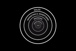
Imagine your brand as an onion, with each layer adding depth and flavor. At its core lies your logotype, its fundamental element. Every layer that surrounds this core will contribute different elements that, if done correctly, will help your brand succeed. Let’s dive into these layers.
1. Logo: The Tip of the Iceberg
Your logo is the visual cornerstone of your brand. It’s the first thing people see and the graphic element they associate with your business. While it’s just the tip of the iceberg, a well-designed logo is fundamental in initiating brand trust.
2. Brand Identity: Colors, Typography, Patterns, and More
Beyond the logo lies the broader spectrum of brand identity. This includes your brand’s colors, typography, patterns, and other visual elements like photography style. These elements work together to create a cohesive and memorable brand image that resonates with your audience.
3. Branding: Shaping Your Brand's Narrative
Branding is the process of crafting your brand’s story and identity. It includes your brand strategy, defining values, voice, personality, target audience, and market positioning. Additionally, branding extends to every touchpoint that shapes the brand experience, from how you communicate with customers to the sensory elements like smell, sight, and touch. Effective branding creates a strong emotional connection with your audience, turning them from customers to fans.
4. Marketing and Advertising: Amplifying Your Brand's Message
Once you’ve established your brand identity and strategy, it’s time to amplify your message through marketing and advertising. This includes strategies like content marketing, social media campaigns, and paid advertising, all aimed at reaching and engaging your target audience.
5. Sales: Converting Leads into Customers
The final layer of the brand-building process is sales. This is where all your branding and marketing efforts culminate in converting leads into customers. If your previous layers are well put together and you have a strong brand, the sales process can become smoother, as customers are already familiar and comfortable with your brand.
To finish this article, I’d like to point out the most crucial element, which I seem to have forgoten to mention: your product or service. While these 5 layers can help you attract more clients and build brand trust, if your offering isn’t top-notch, you might make a sale once, but that’s where it ends.
In conclusion, building a successful brand requires attention to each of these layers. From logo to marketing, to sales, each layer plays a crucial role in shaping your brand’s story and connecting with your audience. The more attention to detail and professionalism applied to each layer, the greater your brand’s chance of success.
What other aspects of brand management are you curious about?
Mariana and her team were fantastic to work with. Responsive, understanding, and organized. Most importantly the quality of the work is exceptional. I am tremendously proud to be represented by the branding that Design Etiquette created for my business.
Brandon Chillingworth — Hacked BD
The X-Factor in Branding: Your Brand Strategy
— The X-Factor in Branding: Your Brand Strategy — The X-Factor in Branding: Your Brand Strategy
Branding, Business, Strategy
When designing a brand identity, initiating the process with a brand strategy provides a clear path to develop the brand. It offers insights into color choices, helps determine the best typography to convey the brand’s personality, and guides the development of its copywriting, among other crucial elements. This strategy later serves as a guideline for the business to understand clearly how they could construct their communication, structure their marketing, and manage their brand.
Creating a brand strategy takes time for research and analysis, increasing the cost of a branding project. However, it is a must-have for brands that want to do things right from the start.
So what is a brand strategy?
It is a guideline that defines how your brand will establish its character, connect with its target audience, and differentiate itself in its market. A brand strategy lays the foundation for your brand identity. It includes elements like:
It is a guideline that defines how your brand will establish its character, connect with its target audience, and differentiate itself in its market. A brand strategy lays the foundation for your brand identity. It includes elements like:
Brand Purpose
Why does your brand exist? Brand purpose is the underlying reason for a brand’s existence beyond just making a profit: making a positive impact on society, addressing a higher goal, or contributing to a cause. It focuses on the positive influence your brand will have in the world.
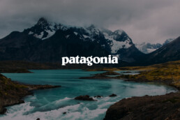
Take for example a brand like Patagonia. Its purpose goes beyond selling outdoor clothing and gear. The company is known for its commitment to sustainability and social responsibility. Patagonia actively works to reduce its environmental impact, promotes fair labor practices, and donates a percentage of its profits to environmental causes. Additionally, they encourage their workers to go outside and enjoy nature, fostering a connection between their employees and the values they uphold.
Brand Voice
The ‘tone & voice’ of a brand refer to the consistent style and manner in which a brand communicates its messages. The tone represents the emotional expression in the brand’s communication: friendly, formal, playful, while the voice is the distinctive way in which a brand speaks: conversational, informative, humorous, or serious.
Think about Nike, and how its brand is characterized by a motivational and empowering tone. The company communicates with a bold and inspirational voice, encouraging individuals to push their limits and strive for greatness. Their communication often features strong, dynamic language that revolves around concepts of sportsmanship, determination, and achievement.

Brand Values
Brand values are the fundamental beliefs and principles that guide a brand’s decisions and interactions. They represent the core ideals and ethical standards that a brand adheres to, shaping its identity and influencing how it engages with its audience and market.
Apple is known for several core values that shape its brand identity. Starting with “Innovation”, Apple strives to create cutting-edge products that set trends in technology. Then we might add “Simplicity” for their user-friendly designs and intuitive interfaces. And include “Design Excellence”, since the brand places a high value on design aesthetics and aims for an incredible visual appeal in their products.

Brand Story
A brand story is a narrative that includes the essence of a brand, its history, values, and purpose, often mixing together elements of the brand’s journey, mission, and unique characteristics to create a memorable and engaging account that will be remembered by your audience.
The Airbnb brand’s story is one of connection and the feeling of being at home. The company started with the idea of creating a network of hosts and travelers who shared a love for travel, by offering a platform for individuals to rent their homes. Airbnb fosters a sense of community and cultural exchange.

When creating a brand identity, initiating the process with a well-defined brand strategy provides a clear roadmap, ensuring your brand’s direction aligns seamlessly with all its elements.
Mariana and her team were fantastic to work with. Responsive, understanding, and organized. Most importantly the quality of the work is exceptional. I am tremendously proud to be represented by the branding that Design Etiquette created for my business.
Brandon Chillingworth — Hacked BD
Color Psychology in Brand Identity
— Color Psychology in Brand Identity — Color Psychology in Brand Identity
Branding, Business, Strategy
Exploring The Subconscious Influence of Color in Branding
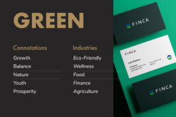
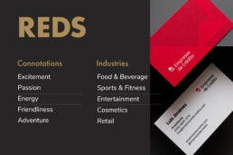
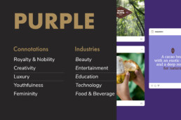
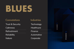
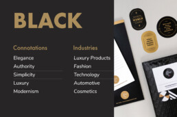
Color is one of the most important elements in branding. Colors mean different things to different people, playing an important role in shaping every brand’s identity and influencing how your business will be perceived in the future. A deep red, for instance, may not feel as sophisticated as a dark black, and a navy blue will never be as friendly and cheerful as a sunny yellow.
However, it’s crucial to consider the cultural context of your brand when choosing colors. Take red, for example: in Western cultures, it’s often linked to passion, love, and danger, whereas in Chinese culture, it represents good luck, happiness, and prosperity.
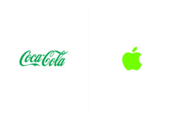
Imagine if iconic brands swapped their signature colors – Coca-Cola in green would just feel off, and Apple wouldn’t have the same sleek appeal in neon hues.
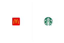
Established brands often lean on color traditions within their industry. Consider McDonald’s with its iconic red and yellow theme, a color combination that’s become synonymous with fast food worldwide. But then there’s Starbucks, boldly breaking the mold with its signature green, a stark contrast to the typical browns and blacks of traditional coffee shops. The choice to blend in or stand out with your color palette isn’t a matter of right or wrong. It’s a strategic decision, a crucial piece of the branding puzzle that needs careful consideration right from the start.
In my opinion, picking the right colors for a brand is super underrated. It’s tough, really tough. Even for pro brand designers, getting those colors just right is a bit of a juggling act. And if you’re new to this? Well, you’re probably going to spill the milk a few times before you get it right. Do designers and brand owners really sweat over this stuff as much as they should? They definitely ought to, because a brand’s color palette can make or break a brand.
Taking some advice from Gary Vaynerchuk’s book ‘Jab, Jab, Jab, Right Hook’, it’s all about giving your audience valuable information. As he says, ‘Give value. Give value. Give value. And then ask for business.’ So, here’s my two cents on how colors work in different industries and their meanings in society’s collective perception. When picking your brand’s colors, choose to go with a color palette that’s similar to other businesses within your niche, or choose a different route altogether, but choose wisely—your colors are a big part of your brand’s story.
Mariana and her team were fantastic to work with. Responsive, understanding, and organized. Most importantly the quality of the work is exceptional. I am tremendously proud to be represented by the branding that Design Etiquette created for my business.
Brandon Chillingworth — Hacked BD
The Death of Print: Myth or Reality?
— The Death of Print: Myth or Reality? — The Death of Print: Myth or Reality?
Branding, Business, Creativity
Is Print Really Dead?
A couple of months ago I was contacted by Idn Magazine, a design publication from Hong Kong. Their upcoming edition talks about brand identity, and more specifically business cards. I was thrilled to learn they wanted to feature our projects in their new edition and asked for my insights on the relevance of printed materials today. This email made my month and triggered a safari of ideas in my head.
“Print is dead!”. That’s what haters will say. For UI/UX designers and some business owners, printed materials have been dead for the past twenty years when social media started killing marketing and advertising as we knew it.
Twenty years sounds like a lot of time, but in retrospect, time can flow like water through your fingers, making two decades feel like yesterday. Social media and Web 2.0 transformed life in unimaginable ways, especially for a millennial like me, who has lived half in analog and half in digital, making me feel like I was born either too late or too early.
We millennials have lived a part of our lives with bicycles, cinemas, VHS, MTV, and uncensored bullying, which have been gradually replaced by smartphones, Netflix, Spotify, Uber, and fourth-place trophies.
Before social media, print was a thing: For breakfast, we didn’t scroll through our Facebook feed, we read the back of our cereal box or the newspaper. Cluttered catalogs have turned into e-commerce, and we’ve exchanged random flyers in the mail for hyper-targeted Meta ads. Thanks to social media and digital marketing, you can now connect with people around the clock, with a purpose and in a targeted way. The tables have turned making digital communication the new normal.
If you look around your house right now, chances are you won’t be able to find a flyer, coupon, business card, or brochure. Most of our books are digital. We take thousands of photos but only print one percent of them. Is print really dead?
My take on this is complex, and my opinion may not be popular. Right now I would compare print to one of Sookie Stackhouse’s lovers: a vampire that has been half-dead for the past ten years but is still handsome, elegant, clever, and thriving. It can sometimes look outdated and even creepy, but it can also be a beautiful rarity that can still hypnotize your customers. After all, we only print the best photos, buy the physical books when they are good enough for our library, and give out our spot-gloss business cards only to very important people.
Yes, digital is the new normal, but it is also saturated, much like printed communication was twenty years ago. Going old-school by printing a flyer for your business or sharing your brand story on the back of your packaging offers a golden opportunity worth exploiting. Today a well-designed packaging, brochure, or business card is a sexy vampire waiting to use its fangs on whoever has eyes to see.
